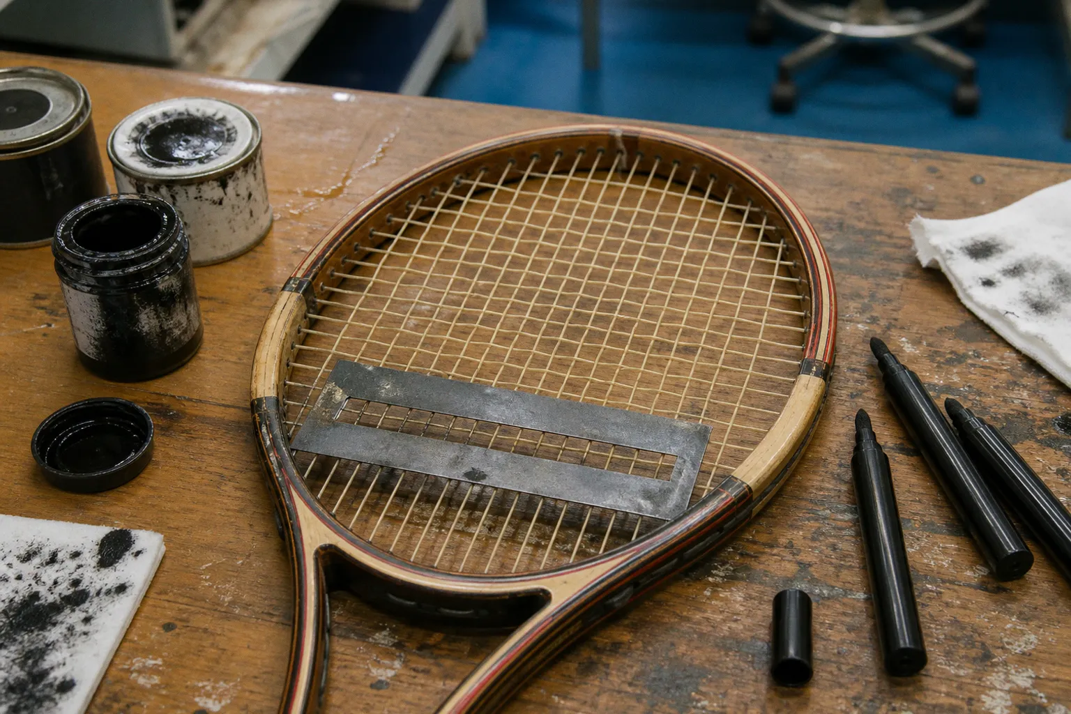
This is the small visual negotiation behind professional racket stenciling: a Wilson, Head, or Yonex frame can become the visible stage for a string brand whose logo appears only where the ball is struck.
The practice is easy to overlook because it occupies so little physical space. Yet the stencil sits at the exact centre of the sport’s public image, suspended between player, equipment, sponsor, and court. It is branding reduced to a few lines of ink, applied with a cutout and a quick hand, then displayed under the concentrated light of competition. The tennis racket string stencil history is therefore not only a story of advertising. It is also a history of how tennis learned to make the equipment of play speak.
From natural gut to branding: the Babolat legacy
The story begins with the material itself. In 1875, Pierre Babolat pioneered the manufacture of natural gut tennis strings, establishing the foundation for a company that would later become one of the most visible names in racket equipment. Natural gut was not originally a branding surface in the modern sense — it was a technical material, valued for its feel, elasticity, and response — but its emergence created the commercial category that made string identity possible.
Before strings became a prominent branded object, they were largely understood as part of the racket’s working interior: a woven tensioned surface, essential to impact but visually subordinate to the frame. The wooden racket defined the silhouette. Its handle, throat, and head carried the shape that spectators could recognise from a distance. The strings were more anonymous, even though they governed much of the sensation at contact.
That anonymity changed gradually as string manufacturers developed distinct products and professional endorsements became increasingly important. A player’s racket was no longer simply a racket. It was a combination of frame, string material, tension, grip build-up, weight distribution, and personal adjustment. The string could be natural gut, synthetic gut, polyester, or a hybrid arrangement; each choice carried consequences for comfort, durability, tension maintenance, and control. A visible stencil gave the manufacturer a way to claim a place within that technical arrangement.
Babolat’s double horizontal lines became one of the clearest expressions of this idea. The mark was designed to sit at the bottom of the string bed, where it could identify the strings without competing with the principal stencil used for the racket frame. Its form is modest — two lines rather than a large emblem — but that modesty is part of its intelligence. The logo does not need to dominate the racket. It only needs to be recognisable to the people watching closely.
This is how string branding acquired its own grammar. The frame manufacturer could occupy the centre or upper portion of the racket face, while the string brand placed its signature lower down. The two marks existed together without necessarily cancelling one another out. One represented the architecture of the racket; the other represented the material stretched through it.
A string stencil is a small act of separation: the frame names the instrument, while the mark on the strings names what meets the ball.
That distinction matters because professional tennis has always been attentive to equipment as both tool and symbol. Players may change rackets, paint jobs, string types, or endorsement arrangements, but the visible details are read as evidence of what lies beneath. A stencil cannot reveal every technical fact about a player’s setup, and it does not alter the way the strings play. It can, however, make an otherwise hidden component part of the public language of the match.
The geometry of the string bed
A stencil is not applied wherever there is empty space. Its position is governed by the physical geometry of the racket face, the pattern of the strings, the existing frame logo, and the need to keep the mark legible without interfering with play.
The conventional application uses a plastic or cardboard cutout placed over the strings. Ink is then spread across the stencil, passing through the open portions and leaving a recognisable design on the string bed. The result is temporary in the life of a heavily used racket — friction, ball impact, string movement, and cleaning gradually wear the image away — but it is highly visible during the period when the racket is in active competition.
Placement near the lower part of the string bed is especially useful for a dedicated string logo. It leaves room for the racket manufacturer’s primary mark and allows the string identity to remain distinct. Babolat’s double-line design was developed specifically for this relationship: a string stencil that could occupy its own territory without overlapping the main frame stencil or creating visual confusion.
The arrangement also reflects how a racket is seen on television. The face is often presented briefly but repeatedly — at the service line, before a return, during a changeover, or as a player turns the racket in the hand. A logo that is too close to the frame may disappear into the racket’s paint design. One placed across the most active central area may become broken by ball contact and string movement. A lower position gives the mark a stable visual field while keeping it close enough to the action to be noticed.
There is a practical elegance in that balance. Branding must be present, but the racket must remain a working object. A professional player cannot afford a visual gesture that complicates string maintenance or obscures the equipment team’s ability to inspect the bed. The stencil is therefore effective precisely because it submits to the racket’s construction rather than pretending to replace it.
What the stencil does — and does not do
The purpose of a stencil is often misunderstood because the mark appears directly on the strings, at the point where spin, speed, and impact are produced. But the ink itself is not a performance treatment. It does not increase spin, restore tension, soften impact, or change the response of the string bed.
| Element | Function | What the stencil contributes |
|---|---|---|
| Racket frame | Provides the structural shape and platform for play | The frame logo identifies the manufacturer or model family |
| Tennis strings | Create the striking surface and determine much of the racket’s response | The string brand may be shown through its own stencil |
| Stencil cutout | Defines the shape of the visible mark | Controls the logo’s placement and recognisability |
| Ink | Transfers the design onto the string surface | Adds temporary visual branding, not playing performance |
| Television and photography | Carry the image beyond the court | Turn a small equipment detail into part of a player’s public identity |
The stencil is visual branding, nothing more — but “nothing more” should not be confused with “unimportant.” Professional sport is built from details that have no direct mechanical effect and enormous cultural effect. A shirt colour does not make a player faster. A racket paint job does not automatically make a forehand heavier. Yet both become part of how spectators remember an era.
String stenciling belongs to the same category of detail. It tells the viewer that the invisible technical layer of the racket has a manufacturer, a history, and a commercial presence.
Why do tennis players stencil strings?
The most immediate answer is endorsement. A string company wants its product to be visible in the hands of a successful player, particularly when the player’s racket appears in close-up or is shown repeatedly during a televised match. The stencil offers a compact form of product placement that does not require a separate object or interruption. It sits inside the action.
There is also a question of recognition. A frame may be painted to resemble a current commercial model, while the actual equipment used by a professional player is customised in ways that are not visible to the public. The strings are similarly difficult to identify by sight. Their colour, texture, and gauge may be concealed by the speed of play. A stencil makes the string brand readable even when the product itself cannot be inspected.
For the player, the mark can also confirm an equipment relationship. Not every visible stencil tells the whole story of a contract, and not every player’s setup is as simple as a single brand logo might suggest. But a stencil communicates affiliation in the language of the court: quickly, repeatedly, without explanation.
There is a deeper cultural reason as well. Tennis has always given equipment a particular kind of intimacy. The racket is held against the body for an entire match. Players notice the sound of the strings, the texture of the grip, the change in tension, the slight shift in balance after repeated impact. To the spectator, these things are mostly hidden. A string logo provides a small point of access to that concealed technical world.
That is why custom tennis string stencils are more than decorative novelties. They allow a brand to create a signature independent of the frame manufacturer. A dedicated string company does not need to produce the entire racket in order to establish a presence on court. Its identity can travel through the string bed, attached to the exact surface that receives the ball.
The stencil is especially powerful for brands whose products are used across different racket platforms. If a player’s frame changes, or if the paint design changes with a new campaign, the string logo can remain consistent. It becomes a thread of continuity — not a mechanical one, but a visual one.
The Sampras anomaly: when string logos outshone frame deals
Pete Sampras provides one of the clearest examples of the complicated relationship between racket identity and string identity. During periods when he did not have an active endorsement contract with Wilson, he continued to play with Wilson Pro Staff frames. Those rackets were stenciled only with Babolat’s double-line logo, representing the VS natural gut strings he used.
The detail is striking because it reverses the expectation that the largest visible logo must tell the whole story. Sampras’s racket remained a Wilson Pro Staff in physical terms, yet the string mark could become the most legible branding element on the racket face. For a viewer who understood the equipment language, those two lines carried important information: the frame and the string were not necessarily tied to the same commercial relationship.
This is the kind of equipment history that tends to disappear when tennis is remembered only through scorelines and tournament victories. Sampras’s serve is preserved in countless images, but the racket in those images also records a more intricate story of contracts, materials, and professional customisation. The stencil marks the point where the public image of a racket becomes less tidy than a catalogue page.
It also illustrates why one should be cautious when reading logos. Seeing a Babolat stencil on Sampras’s racket did not mean that he had switched to a Babolat frame. He played Wilson Pro Staff frames throughout that period. The visible double line identified the strings, not the racket manufacturer.
That distinction may seem obvious to equipment specialists, but it is easy to miss when the marks appear on the same surface and are captured in the same camera frame. Tennis branding often compresses several layers of information into a single image. The knowledgeable eye learns to separate them.
The professional racket is rarely one brand in the simple sense. It is an arrangement of materials, loyalties, modifications, and visible signals.
Sampras’s example also belongs to a broader history of professional equipment being more individual than the retail version suggests. Players may preserve familiar frames long after a model has left the market, use customised specifications beneath a newer paint design, or select strings for qualities that have little to do with the visual identity of the racket. The stencil does not resolve those mysteries. It gives us one accurate fragment.
The chemistry of the court
The ink used for tennis racket logo stencils has to survive a difficult environment. The string bed is not a flat signboard. It flexes, vibrates, shifts under impact, and is repeatedly exposed to friction from the ball and from intersecting strings. The mark must transfer cleanly, dry quickly, resist water, and avoid running across the frame or dripping into unwanted areas.
For that reason, stencil ink is specially formulated to be fast-drying, water-resistant, long-lasting, and drip-free. These qualities sound ordinary until the physical situation is considered. A slow-drying liquid would remain vulnerable during handling. An ink that spread too freely would blur the logo and stain the frame. A formula that failed to resist moisture would lose its definition under court conditions, stringing-room handling, or routine cleaning.
The application itself is simple in principle but precise in execution. The cutout has to sit correctly over the intended strings, and the ink must be applied evenly across its openings. Too little produces a weak, incomplete mark; too much creates seepage and an untidy edge. The best professional stenciling has a controlled density — dark enough to read immediately, restrained enough to respect the structure beneath it.
That restraint matters because the string bed remains a piece of sporting equipment, not a poster. The ink should not be treated as a coating that improves the string’s response. It is not there to increase bite on the ball or create additional friction. Any perceived changes in performance would belong to the string itself, its construction, tension, or interaction with the racket — not to the logo painted across it.
The visual effect can nevertheless be tactile. A dark stencil against pale natural gut or a bright synthetic string bed makes the pattern appear embedded in the racket’s working surface. Under strong arena lighting, the mark may seem almost architectural, with each horizontal or curved element interrupted by the crossing of the strings. That broken continuity is part of its character. Unlike a logo printed on a smooth frame, a string stencil has to live with the texture of the weave.
This is where the material language of tennis becomes visible: friction, tension, flex, and wear all remain present in the image. The stencil does not conceal the string bed. It makes the structure more noticeable.
Modern identity: Solinco and the independent string brand
Dedicated string manufacturers have continued to use stencils to establish identities that do not depend on racket frames. Solinco, for example, uses a distinct stencil associated with its brand — including its recognisable “O” design — on tour rackets. The mark gives the company a separate visual territory in a marketplace where frame manufacturers traditionally possess the most obvious equipment presence.
The significance is not simply that another logo appears on the racket. It is that string companies can speak directly to players and spectators through the same surface where their products perform their work. The brand is not positioned beside the technical story; it is positioned inside it.
This independence reflects the way modern players think about equipment. A racket frame is one decision. Strings are another. A player may choose a frame for its balance and stability, a string for its control and durability, and a tension according to court speed, weather, opponent, or physical condition. The visible stencil acknowledges that the string has its own identity within the setup.
It also gives professional tennis a changing visual vocabulary. A frame logo may be familiar to a broad audience, while a string stencil is often read first by enthusiasts who follow equipment details. These marks become part of the subculture of the sport — the small clues noticed in photographs, racket close-ups, and television replays.
The most memorable examples are rarely dramatic. They are quiet signs, repeated across tournaments and seasons, that reward attention. A pair of Babolat lines at the bottom of a Pro Staff string bed. A Solinco mark appearing across a player’s customised frame. The ink fading as the strings are struck, then returning when a fresh racket is prepared. Each detail connects the match to the work carried out away from the stadium: the stringing room, the equipment contract, the player’s preference, the technician’s careful hand.
Reading the racket beyond the logo
The appeal of racket stencils lies partly in their limits. They tell us something, but never everything. A logo can identify a string brand without revealing the exact string model, gauge, tension, or hybrid arrangement. It can show a commercial relationship without explaining the full terms of an endorsement. It can remain visible after the ink has begun to wear, even as the strings themselves approach replacement.
That partial information is familiar to anyone who studies tennis history through photographs. The sport leaves behind images of rackets, shoes, shirts, grips, and court surfaces, but each image requires interpretation. The equipment is evidence, not a complete confession.
For readers trying to understand why players stencil strings, the essential point is straightforward:
1. The stencil makes an otherwise hidden product visible. Strings are central to racket performance but difficult to identify during play, so the mark gives the manufacturer a public presence.
2. The placement protects separate identities. A string logo can sit low on the bed while the frame manufacturer occupies another area, allowing both brands to remain legible.
3. The ink is engineered for the conditions. Fast drying, water resistance, durability, and controlled application matter because a string bed is a moving, abrasive surface.
4. The image belongs to the history of professional customisation. A player’s frame and strings may come from different manufacturers, as the Sampras example makes clear.
5. The mark is visual, not mechanical. It does not add spin, increase tension, or change the playable qualities of the strings.
This is enough to make the stencil worth noticing without turning it into a technical mystery. Its importance is cultural and commercial, but its physical setting keeps it grounded. The logo exists because the strings exist; it remains legible only by negotiating with their tension, movement, and wear.
The small mark that stayed in the picture
Tennis has many forms of branding, from court signage and clothing to racket paint schemes and tournament architecture. String stencils are among the smallest, yet they occupy an unusually intimate position. They are printed directly onto the surface that receives the ball, the surface that trembles at contact and gradually records the labour of the match.
The history of tennis string branding begins with the development of strings as a specialised product, reaches a clear visual expression through Babolat’s natural-gut legacy and double-line stencil, and becomes especially revealing in the equipment arrangements of players such as Pete Sampras. In the modern game, brands like Solinco continue to use the string bed as an independent platform for recognition.
Nothing about the stencil changes the physics of the shot. That is precisely why it is so interesting. The mark is an announcement laid over a working surface, a commercial image subjected to the same friction and tension as the material it identifies. It fades, breaks, and disappears — but while it remains, it gives the spectator a closer reading of the racket.
To look for the stencil is to look beyond the obvious frame and into the layered construction of professional tennis. The match still turns on timing, balance, court position, and the quality of the strike. But just beneath those visible actions is a quieter history, written in ink across the strings.